Creating Accessible Documents
Why should I make all of my documents accessible?
It’s easy to assume that accessibility is just for students with disabilities. Accessibility is for all students. Students with disabilities require accommodations. Accommodations are when we make adaptations that level the playing field for an individual. Accessibility is creating different pathways for learners so that they can choose how they interact with materials If you give your students choices in how they get information from you, they are much more likely to retain that information and apply it. You can start by creating accessible documents.
Who benefits?
- Students with disabilities (whether they disclose or not)
- International students
- Students who speak English as a second language
- Non-traditional students
- All students
Document Checklist
Save all documents as a Word document and have a PDF copy as well. All word documents are easily made accessible (ex: enlarging/brailling purposes) and are compatible with assistive technology. The PDF version will be useful for students that do not have Microsoft Office on their personal computer.
Fonts
Adopt a standard sans serif font – Verdana or Arial recommended. For example:
- Titles – use 18/Arial/bold/blue or black
- Headings – use 16/Arial/bold/blue or black
- Sub-headings – use 14/Arial/bold/blue or black
- Paragraph text – use 12/Arial/black
Titles
Only titles should be in ALL CAPS. Headings and subheadings should be of different color or bold instead.
Italicized Text
Italicized text can be particularly difficult for some students with print disabilities to read. The letters have a jagged line compared to non-italic fonts. The letters also lean over making it hard for dyslexic users to make out the words. When the text size is small, the text is even less legible. A better way to highlight is to use bold text because the letters are clearer and give better contrast.
White Space
Ample white space makes a page more readable and useful because it provides contrast to the print and creates luminance around the text. Best practice is to use 1” margins and double space in between paragraphs/sections. For tests and quizzes, leave ample white space for students to fully answer the questions. Keep in mind that students with a visual impairment or fine motor issue will need more white space.
Text Boxes
Text boxes should not be used in a document – bordered paragraphs have been used to simulate the effect of text boxes.
Images
Avoid using images of text unless it communicates information that is essential and cannot be put into actual text. Images should be clear and not pixelated or blurry.
Safe Characters
All screen readers read the characters in the table below out loud. If you need the typographical symbols to be read out loud explicitly, of the 91 symbols tested, the only "safe" symbols to use across all screen readers tested in their default configurations are the following 17:
| Symbol | Description |
|---|---|
| @ | at symbol |
| & | ampersand |
| / | slash |
| © | copyright |
| ® | registered |
| ™ | trademark |
| ¶ | paragraph |
| • | bullet |
| $ | dollar |
| € | Euro |
| £ | British pound |
| ¥ | Yen |
| % | percent |
| ½ | one half |
| ¼ | one fourth |
| ¾ | three fourths |
| ° | degrees |
Note: If a screen reader doesn't read something aloud, that doesn't always mean you can't use it. It just means that the meaning of that symbol will not be communicated explicitly. If the meaning of the symbol is essential to your message, be very cautious in how you use the symbols. If the meaning of a symbol is only tangential or not essential to the message, you have a bit more freedom. You can and should, of course, continue to use such punctuation as periods, commas, semi-colons, colons, parentheses, quotation marks, dashes, exclamation points, question marks, etc.
Using the Accessibility Checker
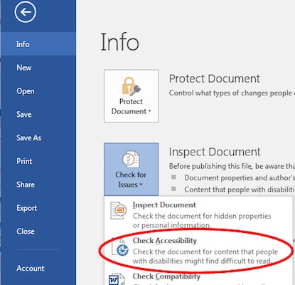
To access the accessibility checker in Microsoft Office, you will need to select File > Info > Check for Issues > Check Accessibility.

The checker presents accessibility errors, warnings, and tips for making repairs. For in-depth instructions on MS Office accessibility, please visit https://support.office.com, search Office Accessibility Center and choose from the drop-down titled “Make your content accessible for everyone.” Here you will find “how to” instructions such as “how to add alt text to images”.
Using the Acrobat X Pro Accessibility Checker
In Adobe Acrobat Pro X, you must first reveal the Accessibility Tool pane. If it is not already displayed, select View > Tools > Accessibility from the Adobe Acrobat X Pro menu. With the Accessibility Tool Pane revealed, you can select the Full Check panel with many options, then simply click Start Checking.
